The photographs in this chapter show how non-human things, often quite ordinary, everyday objects, can be made extraordinary by being photographed. As the title suggests, the stuff of daily life ostensibly counts as the subject, the "something" of the pictures. But because we may ordinarily pass these objects by, or keep them at the periphery of our vision, we may not automatically give them credence as visual objects within art's lexicon. These photographs retain the thing-ness of ehat they describe, but their subjects are altered conceptually because of the way they have been represented. Through photography, quotidian subject matter is given a visual charge and imaginative possibility beyond its everyday function.
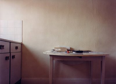
Kitchen Table (from the Dad’s Office series)
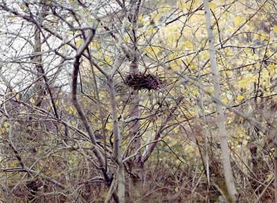
Bird's Nest
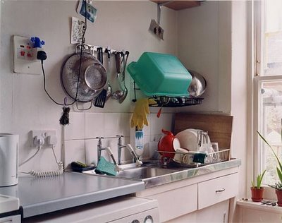
Washing up 16 March 2000, 1:30 pm 2nd photograph of the day. Breakfast crumpets and tea (more with cottage cheese and honey, Ruth’s with Marmite) with Jose and Claudio (who I think washed up)
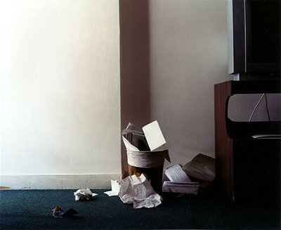
Wastepaper Basket - Mayflower Hotel, Beruit 2003
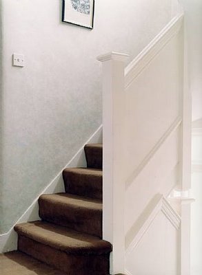
Shannon Family Stairs (from Rachel’s Book)
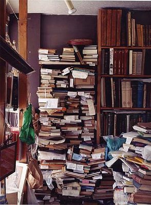
Bookshelves (Archive Bookshop)
Nigel Shafran's work is characterized by the quiet observation of everyday life. His chosen subject matter is deliberately low-key and often domestic in nature: doing the dishes, his Dad's office, charity shops, flea markets. And yet, his work extracts from this something profound and consistently beautiful, the sense of a natural order in ordinary things, or, as Shafran puts it, "an acceptance of how things are."
Questions:
- Cotton wrote: "These photographs retain the thing-ness of ehat they describe, but their subjects are altered conceptually because of the way they have been represented." How do you think this idea applies to Nigel Shafran's photography?
- How do you think Shafran's work expresses "an acceptance of how things are?"
- What does the quality of light bring to Shafran's work?
9 comments:
Could these images be considered as DaDa art because they are making art from the everyday? It's just a thought that crossed my mind.
I think these images are art and not so much Dada because there was consideration of light, color, etc. when Shafran was doing the photography. The arrangement of the objects in the photographs make them interesting to look at as well. I wonder what the books are about in Bookshelves, or where the stairs lead to in Shannon Family Stairs. I think these images show us that we are all people and some of us live in similar ways or have similar habits. It's a reminder of the real and not the fantastical that we see so much in other styles of photography and art. I can see myself living in these environments and feeling comfortable with it.
Shafran's photos remind me of the work of Thomas Demand, but Shafran's work doesn't make me feel uncomfortable. I think it is his use of lighting and the calming effect it brings about the images. Bookshelves is showing complete chaos, yet it is a different chaos than with Demand's Room. It's the kind of unorderly mess that I want to go through, organise, and look through the books instead of steer clear with the bombed room.
Wastepaper Basket is probably my favourite photo in this entry because of the colours and the composition. If you think about it, who stops and looks at trash to see how interesting it is? This photo makes me do that though. The colours are really nice with the whites, browns, and blue carpet. Very pleasing.
So, the light I think brings a calming quality to Shafran's work. It makes you comfortable with the images and want to engage further in studying them closer. This would be a fun style of photography to study further. :)
These images are interesting because the subject is not what we would normally consider subject matter. It is almost like the artist turned the environments into subjects. For example, at first it seems like maybe they just forgot to seat a person on the stairs. But it's this lack of "normal" subject matter that allows you to focus on these subjects that we wouldn’t normally pay much attention to. I agree with Holly that the colors make the images inviting and not static or uncomfortable. You can imagine yourself in some of these environments or relate the images to similar subjects in your own life. I personally like these images more that any of the other groups; I guess because they seem "homely" to me. They make me think of places and objects in my house that I take for granted but that they are really what makes home feel like home. Shafran’s images really make you want to go take a closer look; they are spaces that invite because they seem like spaces where someone should be or where someone has been. My favorite image is Bookshelves because it really draws me in and makes me what to walk in and look more closely.
Holly-
Dada was an art movement in the early 20th century that was concerned with "anti-rationalism", or basically shocking people out of thier complacency and comfortableness and forcing them to confront the irrational. It was a movement that came out of a reaction to World War I, where "rational" governments and complacent populations allowed the slaughter of millions of innocent civilians to take place. Bascially, the Dadaists were saying "if this is what being rational gets us, than I'm going to stand on this stage and recite nonsense syllables while banging on pots and pans because it's saner than being rational."
So yes, they used everyday items when they made their art, but it was more of a reaction against the elitism of the art of the time, which had very specific ideas about craft and the proper use of materials based on "rational" principles of art.
Shafran's work is much to tame to be Dada. Dada is about shock.
Oddly enough, the closest thing to Dada I can think of in contemporary terms would be Jackass.
Ah okay. Whoops. I was thinking more of the use of everyday objects than the intentions behind Dada. I had forgotten a lot about the movement to be honest except that they did use everyday objects like vacuums, toilets, etc. Thank you for refreshing my memory. :)
I think Shafran's work is amazing because of the way he uses light. Each image has a little bit different lighting giving each image a different feel. I am especially drawn to the nest. I find it fascinating how he composed the image. Amoung all the bare trees is this empty nest. It speaks to me about winter in general. Winter is used to express the later years in a human's life. It represents death or desertedness. This image speaks to me in that way quite powerfully.
"The acceptance of the way things are." This is something I have never had a problem with. I am one of those people who likes things not because they are better than other things, but because they are mine. Shafran's artistic depictions of an ordinary home really mean something to me because at one point last year, my family wanted to sell our home and we moved out of it for a period of time. After some months, we could not get the price we were looking for, we moved back and I fell in love with my home all over again. The photographs in this body of work are not of perfectly arranged rooms and coordinating colors, they are of everyday spaces that we tend to not notice anymore. By putting them in photographs, we have a new perspective on our surroundings, and in turn, our lives.
I really enjoy looking at these photographs. They are so simple yet interesting to look at. I really enjoy the idea that I could take these pictures myself. It's nice to look at something that you can relate to and see around all the time. The photography really considers the light and the colors when taking the pictures and that lets me know that there was thought put into the pictures but you can't tell by the idea of the pictures. I like that.
~Brandi Ashlock
"An acceptance of how things are".
That's appropriate for these images. Shafran hasn't tried to model the perfect indoor environment one might see in a catalogue, or advertisement. Things are posed the way they really would be if you were to walk into a stranger's home - nothing was "dolled" up.
If you look at these images long enough and try to anthropomorphize the subjects, they become like portraits - it's like they're pictures of people, looking sternly at the viewer, very much like the paintings photographed in chapter 3. I think it's easy to do this with any inanimate object, if you just try.
I really enjoy these photos. They really give the viewer an appreciation of the everyday world that we live in. They give beauty to the unorganized life of the average person. That's one of the cool things about this set is that these could be anyone's room, bookshelf, wastebasket, or backyard, and yet the artist gives these things substance through photography.
-Zach Phillips
Post a Comment