
Untitled #14, 1999
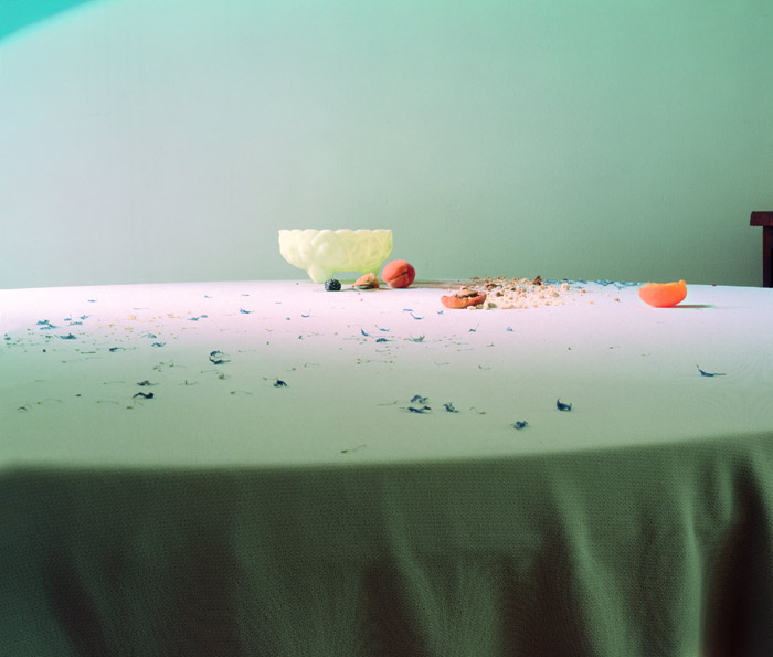
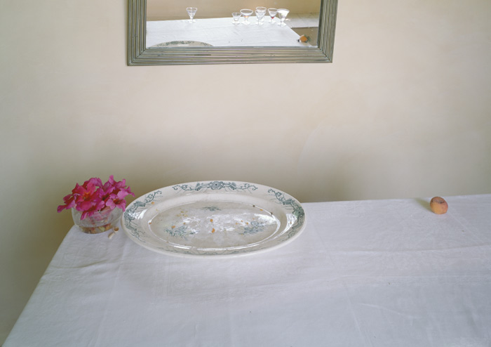
Letinsky's still life imagery “Hardly More than Ever” (1997-2004), is inspired by Dutch still life painting yet pushes the genre beyond its traditional intention. Her still lifes, taken in the morning light, are a residual record of previous gatherings, whether an intimate get-together or larger event. The leftovers become pieces of a vocabulary that construct a visual and emotive tableau distinctly human yet absent of people. Carefully arranged dirty plates, soiled linens, and crumpled napkins act as metaphors not only for the transience of personal interaction but also the fleeting cherished moments of our busy lives.
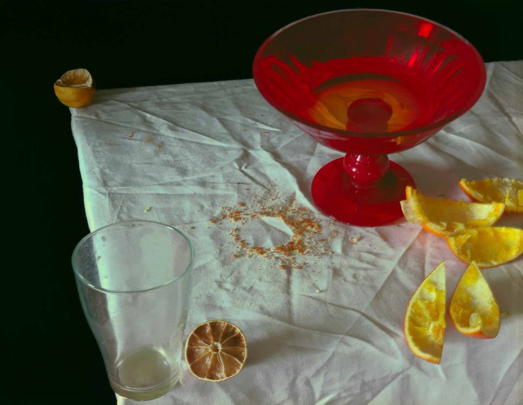
Untitled #10, 1999

Untitled #52, 2002
Untitled #80, 2003

Untitled #55, 2002

Untitled #54, 2002

Untitled #43, 2002
Untitled #92, 2004
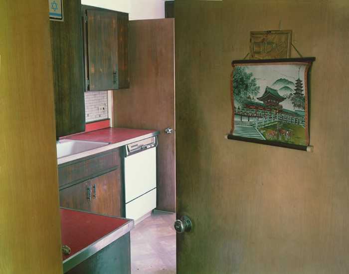
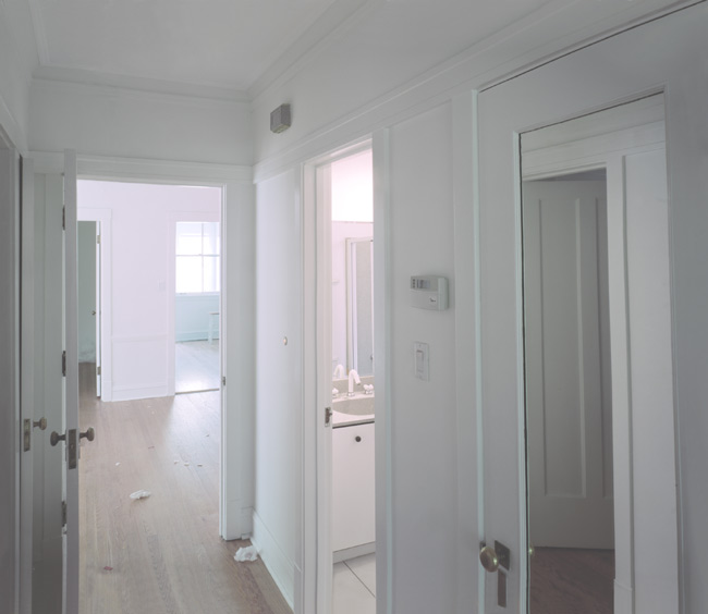
In "Somewhere, Somewhere" (2003 to the present), Letinsky photographed unfurnished rooms in temporary states of transition left with remnants of activity from a previous occupant and untouched by a new inhabitant. Through compositional elements, cropping, and light, the photographs descriptive function becomes an emotive document revealing the subtle complexity of these once intimate spaces. For example, an interior of a hallway reveals open and closed doors with mirrors and reflections that complicate the architecture. Light shines through the window and off the floor where discarded wrapping tissue sits waiting to be swept away.
Untitled #116, 2006

Untitled #111, 2005
Untitled #104, 2005
Questions-
- How would youdescribe Letinsky's use of color in her photographs?
- The author above describes Letinsky's work, writing that the objects in the photographs "act as metaphors not only for the transience of personal interaction but also the fleeting cherished moments of our busy lives." Do you agree?
- Do you find these photographs boring? Why, or why not?
13 comments:
I describe Letinsky's color photographs very dull. The colors are soft and neutral. Colors are not vibrant. I agree what Michelle Vickers said on the colors. It gives me a feeling abandoned, alone, lost. But I have notice that red appears a lot. Its like it wants you to look at that object first. I agree that the author Letinsky's work act as metaphors for social interaction. No I don't think these pictures are boring because Michelle Vickers brought up a point. She said about dishes left out dirty. This makes you ask questions. What did the subjects do before the picture was taken? (Curiosity brings on your mind) And not only that I like the composition. Good Job.
The color Letinsky uses in his photographs is original. There are no fancy manipulations of color. Most of them are neutral. There are some intense colors that draw our eyes such as red. However, it always balanced with another intense color like yellow or green. This balances the visual weight of the picture overall. Also the compositions of all the pictures are excellent. There are organic vs. geometry shape, horizontal vs. vertical, etc. The overall designs of these photographs are very interesting and well done. But the content is somehow seems boring to me. I guess it is because I see familiar things in everyday life, like the kitchen or hallway in the house. But it must be so interesting to look at years ago when I knew little about American culture because it is so different than my own. Here, I think, the curiosity eliminates boringness when look at these pictures.
these pictures sort of remind me of an open house or a house tour. it feels as if im going to look at houses or even for a new apartment. Occasionally, they will have you look at the houses as they are being built, in which case the construction workers leave remnants of that days meal or work in your soon to be kitchen. Or they are still cleaning the apartment to make it ready for the new tennant, the rooms are mostly empty, except for a bit of random trash, like rags they used to clean that day. for me, looking for a new place is exciting, and these photos bring back those feelings. Even tho many are unrelated, the way they are laid out on the web page, i feel like im being lead through a tour of the new place, and the owners have just recently moved or are still in the process, but mostly through. the colors all feel very natural, early morning, you can see the the direct sun seeping through the a window to the side. i can almost smell the coffee. these pictures compared with those from the past, feel very comforting to me
Like has been noted, I just get the impression from "Somewhere, Somewhere" as being something from a realtor's website. They come across as being just pictures of an empty home, shot in such away as not to be jolting and blandly aestetically pleasing.
My impression of "Hardly More than Ever” is that of the table of a poor housekeeper. You can assign a meaning to the images, but on their own, they don't speak about the human condition, at least to me.
I like the color composition that Letinsky has given to ther work. It gives them a simplicity and uniquenest and even though it seem easy to accomplish they have depth and give a sense of history. Yes, I do agree that the photographs are a metaphor for social interaction. Each of the images have a story to tell and gives the viewer a change to speculate what the story is. I do not find this photographs boring. I find them fasinating, to take something so ordinary and transform into millions thinks through your viewers, is something I think every photographer strikes for.
Oralia Gonzalez
I think that Letinsky's use of color creates such an interesting composition in each setting. each picture is arranged differently, yet they are all peaceful to look at. the lighting against the tablecloth creates a softness that the small pieces of colorful fruit accent. i fould myself questioning the placement of the subjects...but after looking at the whole work i notice that it's busy enough not to overwhelm but to create a small amount of energy that moves the eye across the "canvas".
i don't know that i want to worry about the actual images and what they represent. placing a title on an object closes the door for imagination. i enjoy the dreamy quality of the pictures.
1. The use of color seems minimal and is obviously meant to make certain objects stand out.
2. and 3. I suppose I agree, but I think it's a stretch. Yes, maybe I would agree more if I analyzed these photographs at length, but honestly, I found the pictures boring. I did not connect with the photographs at all. I felt like once I'd seen one, I'd seen them all. There was a lack of emotion involved for me with these pictures.
it's really kinda hard to tell if these photos are good or bad. to me they look like random shot the person took with a digital camera. honestly i think i could that those type of photos. i really saw nothing special with them
The color red seems to be prevalent. But aside fromt that I can't really seem to tell what these photos are trying to say. The emptyness of the scenes seems to rob them of meaning. I really don't seem to get anything out of pictures who's meanings are so subtilely stated.
I agree with the notion that these photos "act as metaphors not only for the transience of personal interaction but also the fleeting cherished moments of our busy lives." After reading, it is easy for me to look at the elements in the photos, and imagine them with people in them. In the first few photos, my mind wanders into thinking what happened the night before in these places (the kind of food on the table, did dancing take place at these gatherings, what desert and drinks were served, etc). This is probably mainly due to the fact I love planning parties. I do not find the photographs boring. This is due to the fact they get me involved within them. If they were something I just stared at and didn't cause the slightest bit of reaction towards, of course I would peg them as being boring. But on the contrary, my mind is filled with thoughts when viewing them.
Wow! I was looking at the photographs and I thought why in the world is something taking a picture of nothing? Where is the subject in the pictures. Then I was thinking who would want to look at these "boring" pictures....The more I studied the photographs I became to become more fantaing in this. Its so unique how someone can make all these colors and empty space with one thing or nothing it so ART! That is what art is all about! The photograph really had me thinking. A photograph doesnt need a nice potrait or a nice setting yet it is a nice setting in a different set up!
These photos seem very empty with the use of such soft colors. The little color that is used creates small accents all over the pictures. Although dull, i find them comforting.
Post a Comment