Aliso Village, east of downtown L.A., was a low-income housing complex that was built in the 1940s and torn down in 2000. It is here that Hernandez was born and raised. The Aliso Village images are haunting and empty. They include photographs of graffiti filled walls (Aliso Village 16) and brightly painted closets (Aliso Village 14). To make these images Hernandez would sneak into the buildings when the demolition crew was not there and roam around the vacant spaces. The images evoke memories of another time, when the rooms were furnished and the dwellings populated.
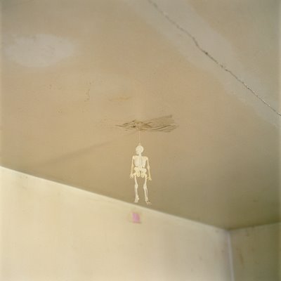
Aliso Village #3
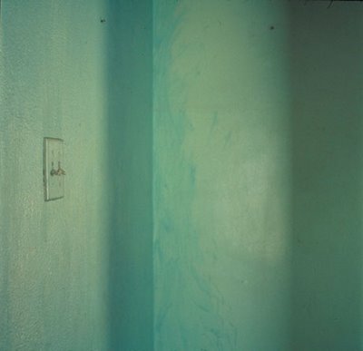
Aliso Village #9
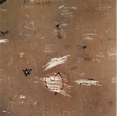
Aliso Village 16

Aliso Village 14
by Jody Zellen
Hernandez is a gifted photographer. He closes in on his subject in order to reveal its intricate details. In the series Landscapes of the Homeless, begun in 1988 and finished in 1991, he carefully documented the out of the way places the homeless retreated to. While photographing these encampments he made sure that no one was about, so as not to disrupt the life of its inhabitants. In these works Hernandez is a voyeur looking in at a community that is obviously other. Yet it is the place, not the people, that interests him.
The resulting large color photographs are aestheticized documents of the homeless' horrible living conditions. These are places built for shelter and survival. Hernandez is not out to artify his subject but rather to point out the inherent contradictions within the urban environment. To make these photographs Hernandez scouted out places where the homeless congregate. The resulting pictures document not only the ingenuity of the homeless but Hernandez' sensitivity to their plight. Viewed at a distance, the images appear to be photographs of the natural landscape. Upon close examination the details of habitation reveal themselves. The contrast between "one's expectation of beauty and the reality of homelessness" is central to the works' impact.

Landscapes for the Homeless #24, 1989
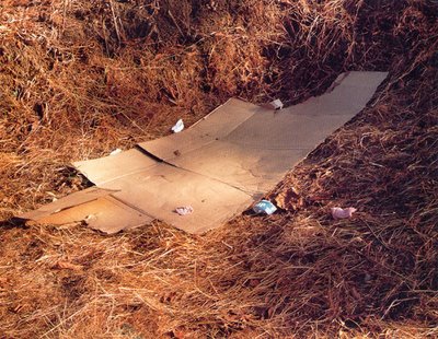
Landscapes for the Homeless #17, 1989
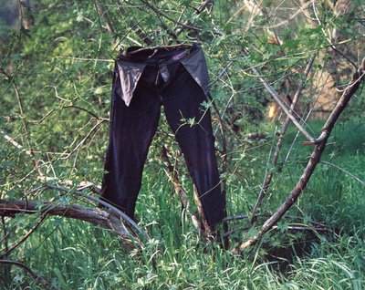
Landscapes for the Homeless #54, 1989
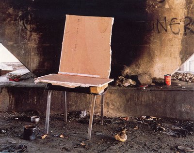
Landscapes for the Homeless #18, 1989
Questions-
- How does knowing Anthony Hernandez' personal history influence what you think about the Aliso Village photographs?
- Do you agree with Zellen, when she writes "Hernandez is not out to artify his subject but rather to point out the inherent contradictions within the urban environment?"
- How does the lack of any human presence effect your experience of Hernandez' images?
7 comments:
I really like the Aliso Village photographs. When I first looked at them without knowing who is behind taking the photos, I admired this wonderful color schema in each of the photos. However, after knowing that Hernandez grew up in this low income housing district, it made me look more at the photographs, rather than simply just admiring the colors. There is a sense of loneliness and an eery feeling that develops inside of me when I look at them. This is mainly due to the fact there is no life present, whether it be human or plant life. Not only is there nothing living, but there is a lot of ‘empty’ space within the photographs. But in each one, there is a particular notice to detail (the skeleton hanging on the ceiling, the light switch, hooks on the wall, etc) that I just keep drawing my eyes toward. I can see how it is the place, rather than people, that interest him. He does an excellent job of peaking my interest in the location as well, making me wonder who lived in these now vacant places.
Hernandez captures how he felt trapped and frustrated within the Aliso Village. Even the picture of the bright pink closet seems to provoke a sense of claustrophobia despite its contrasting intense pink color. The skeleton hanging from the ceiling gives the series a haunting feeling as if this space is filled with ghosts of an unhappy childhood. Perhaps Hernandez felt artistically frustrated and stunted in such a low-income area. I can’t imagine that his artistic pursuits were well nurtured in such an upbringing. The graffiti seems to be a collection of children’s drawings that have been aggressively scratched out in frustration. The contrasting green paint colors also emit feelings of inner conflict.
On Aliso Village:
It's empty and dirty. As bold as the photographs are those are the only appropriate words to describe them; anything else would be adjectives stuffed into exhausted metaphors.
On some levels it angers me. I don't think most people know what they are looking at. I can't really say that I do. There it is, poverty, and to describe a photograph doesn't describe poverty. It can't. Poverty is cruel and repetitive. For those who have lived in it, it's just life. After a while the cracks on the wall are commonplace, and the graffiti becomes ones own embellished expression. The impoverished kind of just live as they do with no real expectations of getting out, and any other groups usually just observe and contain with no real intentions of helping the less fortunate.
Hernandez is a rare being to be entrapped by all this ugliness and then to step out of its boundaries and observe his surroundings enough to know that something is wrong. This sounds simple but it is an extremely difficult task. I appreciate the way he leaves his rooms empty, and although they still convey poverty the audience adds characters and settings with their minds. For some the characters are just adjectives. Other people are reminded of novels and politics. There are viewers who get lost into the thoughts of their immigrant grandparents living in one room apartments with no plumbing or windows. Finally, in a dejecting example a person looks at one of Hernandez's photographs and feels the tickling of roaches on their feet, and thinks, "home."
Hernandez's work transcends boundaries and relates to various people with different experiences of poverty; to all a single photograph communicates "emptiness" on a dirty canvas.
On Landscapes for the Homeless:
~I love these photographs, in concept, and its aesthetic quality.~
Hernandez's use of just objects depicts homelessness really well. It is even more effective than if there where people in the scene. I say this because there is something a bit pretentious in the idea of someone photographing a homeless person.
--You are standing in front of a person, with no walls or ceiling to call their own, and you have a camera. A camera is a luxury in life its not a necessity. You owning one implies that you have the necessity in order to partake in the activities of the luxury. So there you are asking if you could use their state for artistic reasons. If people were in the scene it would have conveyed a sort of implicit superiority.
-Shy (ma El Sayed)
When I first saw the images of Aliso Village the first thing that popped into my head was how simple and straight forward these images are. They conveyed very little meaning to me at that time, but when later I read about how Hernandez grew up in this low-income housing complex it built up a lot more meaning in the simplicty of the images. As viewers, we probably wouldn't even be able to begin to comprehend the emotions and memories that Hernandez had as he was taking these photos.
1. Without the personal history, I would not give the Aliso Village photographs another look. So the history is very important to me as I'm looking at the photographs. However, I still did not have much feelings for these photographs.
2. I think these photographs are purely documentary. I don't see any "spin" put on them by the photographer.
3. The lack of human presence is insignificant to me. I don't notice it in these photos because there is not much space covered. When I see vast open space with out humans, I notice it. These pictures are so close up that I don't expect to see a human so the thought doesn't really even cross my mind. One thing that I DO think is lacking, particularly in Landscapes for the Homeless #s 17 and 24 is a sense of scale.
i like the photographs when i first saw them based on the artistic qualites of the colors and compositions. after reading what was going on, i understood them more, but i do not agree with Zellen because these are art photographs. While they do document the "inherent contradictions within the urban environment" they are also artistic photos so that the viewer can look at then and appreciate them for just the astheic apeal and then go to the deeper meanings behind them. Knowing about Hernandez's life does make the photos more insteresting because i can understand where he is coming from.
Post a Comment